At Alley, we frequently design sites that require any given component to appear in a variety of contexts. A visual style guide allows us to view the site not as a series of pages, but grouping of reusable components. Ultimately, this simplifies and standardizes the way our designs communicate. In addition, it jumpstarts future components and ensures that every aspect of that design will be legible and recognizable to the user.
The complexities of modern web apps mean that designers and developers need to take the style guide one step further. A “living” style guide effectively shortens the distance between the style guide and a functional web site or app by bringing static design components into the browser and creating reusable, testable, modular design building blocks. A living style guide aims to simplify branding and communication as well as DRYing out your code and giving developers a more focused context in which to work.
We’ve been using living style guides at Alley for about six months and find it to be a huge help managing the design and build for the type of large-scale publications (or systems of publications) we work with. We’ve found that when working on a large build it’s vital to begin the process with a modular mindset. Pixel perfect, hi-fi layouts don’t factor into our process except as a tool for client buy-in; each page is a jigsaw of responsive, reusable, and (mostly) encapsulated components.
Our tool of choice for living style guides is one built by SC5 (here’s their live demo). The tool uses Angular and KSS to generate a style guide (or, as they call it, a “styleguide”) directly from your stylesheets. Alley has found the tool fits in quite nicely with our SASS workflow, though there are still some pain points. (We build custom websites and, ultimately, our style guide may require a more custom solution.) For now, the SC5 styleguide generator is a great jumping off point for anyone interested in using a living style guide for their work.
Organization
The basic syntax of SC5 has ample documentation and at least one very thorough article by the style guide authors themselves. In overview, the tool generates your styleguide from specific commenting patterns in your SASS partials called KSS. The generator also has a few additions to KSS syntax that allow for more complex markup formulation.
One of the most basic KSS functions is to create a section of the style guide. We recommend using a CSS preprocessor like SASS as an effective way to section your style guide (not to mention the variety of other great reasons for using a preprocessor). A preprocessor’s @import will allow you to separate your style guide into encapsulated sections and subsections more effectively. To that end, we recommend putting each of your sections in a separate partial and, if your build is large enough, each related set of partials in their own directory with an “importer” partial.
/
 global.scss <--Top level importer will import the importers
  /typography
     _loader.scss <--Importer partial for typography
     _headings.scss
     _links.scss
The “importer” partial should not contain any actual SASS code, only imports:
// Top Level Section Title
 //
 // Description
 //
 // Styleguide 1.0
 @import 'sub-partial';
 @import 'another-sub-partial';
All the actual SASS code will go in the sub-partials you import:
// Sub Partial Component Title
//
// Description
//
// Styleguide 1.1
.my-component-class {
    color: blue;
    border: 1px solid $brand-color;
}
Using the generator should push you into some good practices. For example, the section layout of the style guide will push you to keep all styles relating to a component in a single partial. That includes context-specific changes and breakpoint changes. This is good for a few reasons:
- Keeping the code in one place will make it easy to get an overview of the component, build new features and make changes.
- Only the code within the partial containing the section declaration will appear in the “Show CSS” section of the style guide front end. If you separate some code into a new, unsectioned partial, that code will not be displayed by the style guide.
- It enforces modular thinking instead of page-oriented thinking. The site you’re building is not a series of pages; it is an ecosystem of individual, reusable components, each with their own distinct purpose.
Using Modifiers to Display Component Variations
One of the features available to us through KSS—and extended by SC5—is the ability to display various element states and variations thanks to the concept of modifiers. Using KSS syntax, we’re able to define a list of different views for the component and give them a description. Each item in the list will then be rendered by SC5 in its own separate container, as part of the component section.
Example:
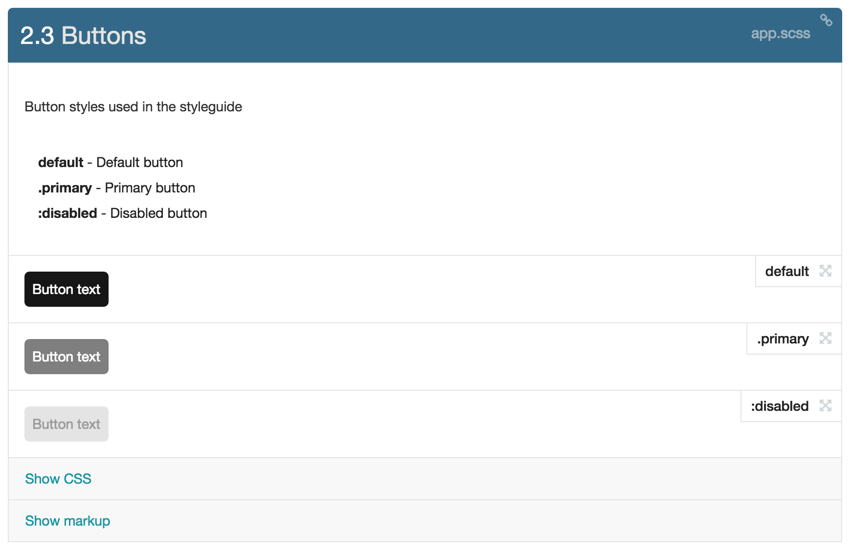
 /*
 Button Styles
 default - Default button
 .primary - Primary button
 :disabled - Disabled button
   markup:
 <button class="{$modifiers}">Button text</button>
   Styleguide 2.3
 */
Along with a set of button styles, this will be rendered by SC5 as:
KSS allows you to define modifiers as a string, but SASS and SC5 take this a step further. You can define SASS variables as modifiers and get creative:
 // Fonts
 //
 // $body - Body Copy
 // $heading - Headings
 // $widget - Widget Titles
 // $meta - Meta info
 //
 // markup:
 // <div style="font-family: {$modifiers};" class="font">{$modifiers}: The quick brown fox jumps over the lazy dog</div>
 //
 // Styleguide 1.2
 $body: 'Source Sans Pro', Helvetica, sans-serif !default;
 $heading: 'Hind', Helvetica, sans-serif !default;
 $widget: 'Oswald', Helvetica, sans-serif !default;
 $meta: 'Roboto Condensed', Helvetica, sans-serif !default;
Wrappers and inherited styles
Because the styleguide’s KSS markup is rendered via shadow-DOM, CSS declarations for wrapper elements will not be inherited to components. This can make it difficult to set base font styles, for example. In order to send style declarations to the shadow-DOM wrapper, they can be added to a class (ex: .body) and included with the commonClass CLI option at runtime.
To simplify your commonClass config string, inherited styles should be set up to cascade into a single class.
Example:
 // Extend common html styles
 %html {
     font-size: percentage($base-font-size/16);
     box-sizing: border-box;
     *,*:before,*:after {
         box-sizing: inherit;
     }
 }
// Styles for html element in theme
 html {
     @extend %html;
 }
   // Extend common body styles
 %body {
     font-family: $font-body;
     margin: 0;
 }
   // Styles for body element in theme
 body {
     @extend %body;
 }
   // Combine html styles and body styles for commonClass wrapper
 .sg-common {
     @extend %html;
     @extend %body;
 }
Now .sg-common will include both html and body styles in the shadow-dom wrapper.
Because the styles will be applied to elements inside the shadow-dom, you may want to separate the body (for the site theme) and .sg-common (for the styleguide) style declarations. For example:
 // Extend common body styles
 %body {
     font-family: $font-body;
     margin: 0;
 }
   // Styles for body element in theme
 body {
     @extend %body;
     padding: 0;
 }
   // Styles for Styleguide commonClass wrapper
 .sg-common {
     @extend %html;
     @extend %body;
     @extend %clearfix;
     display: block;
     max-width: calc-em(1170,16);
     margin: 0 auto;
 }
To include the commonClass when styleguide is run, update your project’s package.json to include –common-class \”sg-common\” as part of the styleguide CLI script to apply the .sg-common class to the shadow-dom when you run the styleguide. In our example, we should the common class in the same document as the body and html classes. However, in reality you should aim to separate all your styleguide-specific code into a different stylesheet.
For more info, see the styleguide docs: html and body styles.
Styleguide Insert
Component markup in the styleguide can be reused in subsequent component blocks using the sg-insert reference tag. This can be useful when modular layout items need to be nested inside of larger layout markup or displayed as a variation adjacent to any additional markup.
Example:
// Component Markup
 //
 // markup:
 // <div class="module-element">
 // ...
 // </div>
 //
 // Styleguide 1.1
    .module-element {
         // styles ...
 }
// Layout Markup With Inserted Component
 //
 // markup:
 // <div class="layout-element">
 // <sg-insert>1.1</sg-insert>
 // ...
 // </div>
 //
 // Styleguide 1.2
    .layout-element {
         // styles ...
 }
For more info, see the styleguide docs: Inserted Markup.
Wrapper markup
While writing KSS markup for components you may find that you need to simulate arbitrary layout or content elements that are outside of the scope of the component on which you’re working. This can be achieved with the sg-wrapper syntax in your KSS.
Example:
// markup:
 // <div class="your-component">
 // ...
 // </div>
 //
 // sg-wrapper:
 // <div class="layout-wrapper">
 // <sg-wrapper-content/>
 // </div>
The sg-wrapper-content does not need to be wrapped, and you may also place it in the flow of example layout content:
// markup:
 // <div class="your-component">
 // ...
 // </div>
 //
 // sg-wrapper:
 // <div class="layout-item">
 // ...
 // </div>
 // <sg-wrapper-content/>
For more info, see the styleguide docs: Wrapper Markup.
External sg-insert Files
For bigger or more complex component builds (for example fly-out menus or lists of posts) you may want to consider building an inserts-only file, comprised only of KSS blocks to be referenced via sg-insert tags in component files. This allows you to keep dummy content and other KSS overhead separate from SASS files needed by the theme to generate stylesheets.
For example, with a list of blog posts, you may want to set up an example-posts.scss file, containing only KSS blocks of example blog posts able to be referenced with styleguide section numbers:
 // markup:
 // <article>
 // ... example post 1
 // </article>
 //
 // Styleguide 2.2.1
 //
 // markup:
 // <article>
 // ... example post 2
 // </article>
 //
 // Styleguide 2.2.2
These article blocks can then be added, for example, to your styleguide component files for a list of blog posts, or a block of featured posts. Each individual component file would then apply its own styles to a reusable set of article markup.
Injecting custom styles for the styleguide chrome
As noted in the docs, you can use the –custom-colors flag to pass in color changes to the styleguide chrome. What the docs don’t mention, however, is the ability to change the layout of the styleguide chrome as well using the –extra-head flag:
--extra-head \"<link rel='stylesheet' type='text/css' href='/styleguide-layout-styles.css'>\"
We’ve used this technique to add in some Alley branding to the styleguide for presentation purposes.
SC5 Exclude and Compiler Errors
Unfortunately, the compiler which generates the styleguide CSS is ultimately designed to render simple component styles, and you may run into issues with any SASS which requires nested calculations or complex logic. In the event that you run into an error with the SC5 compiler, you can wrap any problematic style blocks inside ignore comments:
// styleguide:ignore:start
 // ... l33t scss
 // styleguide:ignore:end
If the blocks within the ignore comments are required for the component to be displayed properly, for example column widths, you may need to find a solution which allows you to use extends or placeholders which don’t require calculations.
CLI Setup
Our front end stack is based around Webpack and NPM. In order to keep things simple and prevent introduction of additional, unneeded complication, we avoid the Gulp set up and use an NPM script and the styleguide CLI to get things up and running. Depending on your setup, this may get unwieldy in your package.json, in which case you can create a simple binary to make things a little more readable:
#!/usr/bin/env node
 var styleguide = require('sc5-styleguide/lib/modules/cli/styleguide-cli');
 styleguide({
     // Styleguide title
     title: 'Alley Styleguide',

     // Styleguide overview path
     overviewPath: 'client/sass/styleguide.md',

     // KSS source material
     kssSource: 'client/sass/**/*.scss',

     // Stylesheets to include
     // global.css: primary site styles
     // styleguide.css: styleguide-only styles
     styleSource: [
         'static/css/global.css',
         'static/css/styleguide.css'
     ],

     // Common wrapper class
     commonClass: 'sg-common',

     // Extra markup to inlcude in the document <head>
     // 1: styleguide chrome styles
     // 2 & 3: typekit scripts
     extraHead: [
         '<link rel="stylesheet" type="text/css" href="/alleysg.css">',
         '<script src="https://use.typekit.net/esr7hkw.js"></script>',
         '<script>try{Typekit.load({ async: true });}catch(e){}</script>'
     ],

     // Custom styleguide scss
     customColors: 'client/sass/alleysg.scss',

     // Output path
     output: 'styleguide',

     // Watch for changes
     watch: true,

     // Serve
     server: true
 });
SC5 Gotchas and Bugs
The SC5 Project is open source and available to view and contribute to on github. Since the project is relatively young, it’s not without issues. For example, while using SC5 on our first project, we uncovered a genuine bug while trying to use <sg-insert> within an sg-wrapper block, and noticed that the markup was not output. I submitted a bug report on GitHub, which was acknowledged within 24 hours. The issue was patched a few months later, and will be included in the next release.