Earlier this year, the Kaiser Family Foundation approached Alley with a challenge: the foundation needed a way to display state-level data on a map, with an accompanying table, in a format that was easy to use and embeddable within posts across their WordPress site. This was not a simple question of adding some graphics to a page. The solution needed to have the following attributes:
- Intuitive and easy to use: The staff needed to be able to plug in some data, tweak a few options, and watch it go.
- Flexible: The map needed to support both text and numeric data while allowing for multiple ways of grouping data.
- Interactive: The map had to support hover and click interactions quickly and smoothly.
- Responsive: The map had to both display nicely and retain full functionality on mobile and desktop.
- Customizable: The application needed to provide a way to customize text and map elements across the site.
Meeting all of these requirements was no easy task. We set to work and quickly formulated a plan to deliver exactly the features KFF needed.
We started by creating two custom post types upon which we could build the structure of this application: one for the color palettes and one for the maps. This allowed us to adjust these independently and provide fine control of all visual aspects of the data presentation.
The color palettes would have a one-to-many relationship with the maps and contain a few customization options (including the ability to choose 2 to 8 colors to use on the map, an accent color for specifically highlighted states, and a color to represent “no data”). Editors on KFF’s team could quickly choose from default sets, while administrators could also go in-depth, tweaking and fine-tuning as they desired.
The map post type was a bit more complex. We added Fieldmanager fields to customize how (and whether) the data table displayed; colors, labels, and highlights of the map; descriptive text associated with each state; and data handling for all inputs. The last item proved the most challenging — for numeric data, but not textual data, we needed to be able to automatically create a specified number of logical groupings on the basis of the data points provided. We first attempted to use a library implementing Jenks natural breaks clustering, but we soon found ourselves ending up with a bunch of strange outliers and weird groupings when we input test data. To solve this problem, we used a library implementing the ckmeans algorithm, which improves upon Jenks. With this algorithm, we were able to consistently group data points in a way that made sense, regardless of the number of groups requested.
Using React and D3, we built an application on the front end that quickly and smoothly displayed our map. React was critical here, as its ability to quickly and efficiently re-render DOM elements gave us a lot of flexibility in making the application interactive. D3 was a natural choice for displaying a map like this — the library makes it easy to work with data like ours and bind click and hover events to the SVG elements it creates. Displaying the data using a TopoJSON-backed map (easily integrated into D3) was lightweight enough to render quickly while being detailed enough to look nice. Viewers of these maps will find them fast, responsive, and beautiful.
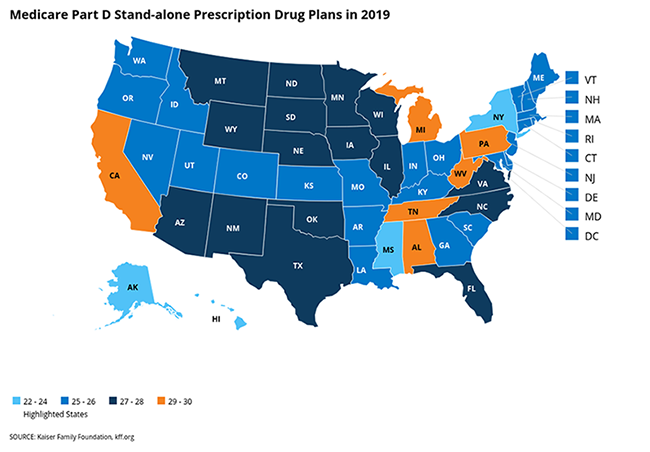
You can view one of the initial maps here. Many more will be launched shortly.
Throughout this process, we worked closely with KFF to develop this map iteratively, collecting continuous feedback to ensure that the product met their expectations. The relationship between the Alley team and KFF was key to getting this project done right, and our teams’ communication was essential to delivering an amazing map experience.
KFF is now rolling out this application for use in posts, issue briefs, and fact sheets across the site. It’s both a novel way of displaying information and a lightweight replacement for an older, heavier, and less flexible application. And more is in store — plans are in the works for a second phase of the embeddable maps project that will add new functionality and refine existing features.
We’re pleased that this solution allows the Kaiser Family Foundation team create maps that help readers easily digest large amounts of information, and we can’t wait to build on this work.
Do you have data that might be challenging to present? What innovative ways to display that data are you considering? Let us know, and maybe we can help!